Enhancing P2P Transaction Experience through Transparent Fee Previews and Improved Payment Navigation
OVERVIEW
PayPal's P2P transactions are plagued by issues that create confusion, hinder trust, and lead to frustration and drop-offs.
OBJECTIVES
Increase user satisfaction
Encourage users to utilise P2P services more frequently
Boosting overall platform engagement and customer retention
METHODES
User Interviews
Competitive analysis
Affinity Diagram
Persona
HMW
Crazy 8
Impact-Effort Matrix
User Feedback
IMPACT
We focused on improved fee transparency, efficiency, and user confidence in PayPal transactions.
67% Increase in User Satisfaction: Experience rating rose from 5.2/10 to 8.7/10.
100% Fee Comprehension: All users correctly identified transaction costs before confirmation (up from 30%).
INTRODUCTION
It all started with a question when I wanted to pay my mentor. ”Do you mind if I pay another way? PayPal is so confusing!”
That was the moment I stopped and asked myself, why don’t I like PayPal? This simple question sparked a deeper curiosity: Was it just me, or were others struggling with PayPal too?


Together with my fellow designer, we began questioning what was behind this frustration, leading us to step back and explore the bigger picture—the root problem.
PROBLEM
PayPal's P2P transactions are plagued by issues that create confusion, hinder trust, and lead to frustration and drop-offs.

PayPal's usability issues are driving users away, damaging its reputation, and amplifying frustration in public discussions.
By optimizing these elements, PayPal can increase user satisfaction, improve transaction completion rates, and encourage users to utilize P2P services more frequently, ultimately boosting overall platform engagement and customer retention.
Who said so?
Credible Websites
Voices of frustration on Twitter


Let’s validate our assumptions.
Process
+6 user interviews revealed the difficulty of use and lack of transparency when making P2P transactions.
Themes started to emerge after we mapped all the insights. These were the most shown themes, which gave us solid ground to further plan our process.


Discover
There are two types of users using PayPal for P2P transactions: one is frequent users seeking efficiency, and the other is infrequent users seeking transparency based on gathered insights.


Simplify the fee breakdown for PayPal users so that they can quickly understand the total costs before completing a transaction?
Simplify the navigation process so that users can quickly access the most important functionalities?
Increase the flexibility users have when managing their future transactions?
Competetive Analysis
Competitive analysis indicates that PayPal falls short in terms of fee transparency, ease of use, feature set, and user engagement when compared to modern fintech apps such as Revolut, Wise, and Skrill.
To address the problems we identified, we analyzed popular fintech apps used for P2P transactions, such as Revolut, Wise, & Skrill.
Here are the summaries and in detail analysis of them.


Wise- Trustworthy and Transparent Transactions
Easy Access to core Actions
Wise's homepage structure ensures that key actions (Send, Request, Add Money) and the most needed functionalities are easily within reach.

No surprises at checkout with clear and upfront fees.
Deductibles and fees are displayed at every stage, reinforcing trust and eliminating uncertainty. Whether it’s currency exchange, transfer fees, or payment breakdowns, Wise makes sure the user never encounters hidden costs.


Increased user awareness prior to, during, and after the transaction


Skrill-Transaction-Focused Experience
Skrill offers a transaction-focused experience that prioritizes fee transparency, currency exchange, and quick financial actions.
Core Actions Placement
Key financial actions (Add Money, Transfer, Exchange) are prominently displayed at the top of the homepage, reducing friction.


Clarity with Colours and Labels
Well-placed labels and use of color contrasts (“Instant,” “Free,” “Fee 2%”) ensure immediate clarity on transfer terms.
Wise also uses color contrast to highlight important notifications, resulting in less friction and ambiguity.


IMPACT EFFORT MATRIX


FINAL DESIGN
Improving Clarity, Navigation, and User Control
The new homepage simplifies navigation by placing key financial actions—Transfer, Exchange, and Add Money—at the centre of the screen.
Old Homepage
❝ Some options feel buried inside menus—I just want to send money quickly. ❞
❝ On PayPal, some options are not clear at all and are not easy to find at first, like adding to my balance or exchange rates when sending internationally. ❞
❝ I have ADHD and I have problems finding options on this app a lot. It takes too long to find what I need, especially when I’m in a hurry. ❞
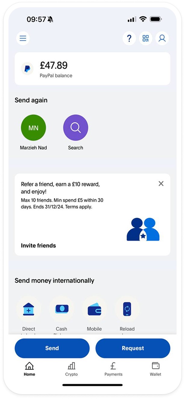
The homepage was cluttered with "Send Again" suggestions and promotional banners (e.g., "Refer a friend").
Essential features like "Add Money" and "Exchange" were missing from the homepage.
The balance was shown, but with no alerts or guidance for next steps.
New Homepage

Key payment actions (Transfer, Exchange, Add Money) are prominently displayed at the top, reducing friction.
Alerts provide proactive notifications for users to manage their balance.
The homepage is cleaner, with a focus on transactions rather than promotions.
Old Payment screen
❝ I wish I didn’t have to see the profile and photo of people I sent money to once a year ago—it makes it hard to focus on what I need to do.❞
❝ At first, I was really confused about how to do transactions, but after a while, it became easier. It shouldn’t take this long to figure out.❞

The navigation was cluttered, with a mix of frequent contacts and payment options displayed in a less structured way.
The “More Options” section made core actions feel secondary.
New Payment screen

We organized options more clearly. Payment actions like "Send," "Bill," "Give," and "Request" are tabbed at the top, making it easier for users to find and switch between different payment methods
Icon colors are changed to reduce distractions, and layout changes help reduce cognitive load.
Enhancing Fee Visibility & Transparency To Avoid Surprises
For many PayPal users, transaction costs felt like a guessing game. Fees were often buried in the process, only appearing at the final step, leaving users frustrated and unsure of the total amount they would be charged. Without a clear breakdown, users lacked control over their payment choices, sometimes unknowingly selecting options with higher fees.
Our redesign changes that by surfacing fee details at multiple touchpoints—during payment method selection, transaction review, and confirmation—ensuring users stay informed every step of the way. Now, users can compare costs upfront, avoid surprises, and make confident financial decisions with ease.
❝ I just had money transferred that was $10, but for some reason I got a fee for it. Why did I get a fee? I never got fees before. ❞
❝ Trying to send 120 pounds to England, but the app kept asking for extra money due to unclear fees.❞
Unclear fee in the Old design

Fee clarity in the new design


We surfaced the fee breakdown at multiple points throughout the transaction process to ensure users are continuously aware of the cost.
From selecting the payment method to the final review screen, fees are clearly displayed—including PayPal fees, exchange rates, and total payment amount.
Users can compare different payment methods and their associated costs before proceeding.
Old send money screen

❝ Sometimes I don’t realize I need to add money until the last step. ❞
The original design only allows the user to enter an amount with a small currency selector next to it. The exchange rate is only visible later in the process.
The screen doesn’t show the user’s available balance, making it unclear whether they need to add funds.
New Send money screen

The redesigned screen shows both the sender’s and recipient’s currency right from the start, along with the exchange rate. This prevents surprises about conversion rates later in the flow.
Our design displays the PayPal balance directly below the amount field, making it easy to see if a top-up is needed.
Clarifying Exchange Rates: Removing the Uncertainty in Currency Conversion
Understanding exchange rates shouldn’t need a blind trust. In the previous design, users saw only the current exchange rate at the moment of transaction, without any historical context or clear differentiation between conversion fees and actual rates. This lack of transparency led to confusion and discrepancies in the final transaction amount.
With our updated design, users now have access to real-time exchange rate trends. Additionally, we’ve separated exchange rate fees from transaction costs, making it clear how much users are paying for the conversion itself. This helps users make informed decisions about when to send money, ensuring they get the best possible value.
❝ I did not know if the fee is from PayPal or the exchange rate itself.❞
❝ I don’t want to guess if it’s a good time to send money, I need to see how rates have changed before I decide.❞

The old screen (left) shows only the static exchange rate at the moment of the transaction. Users must trust that they are getting a fair rate without any context.
The redesigned screen introduces a graph displaying historical exchange rate trends, giving users insight into fluctuations over time (weekly, monthly, and annually).
Users only see the exchange rate without a clear indication of how it affects fees or the final amount.
The new version explicitly separates the exchange rate and any additional fees, ensuring users understand what they’re paying for.
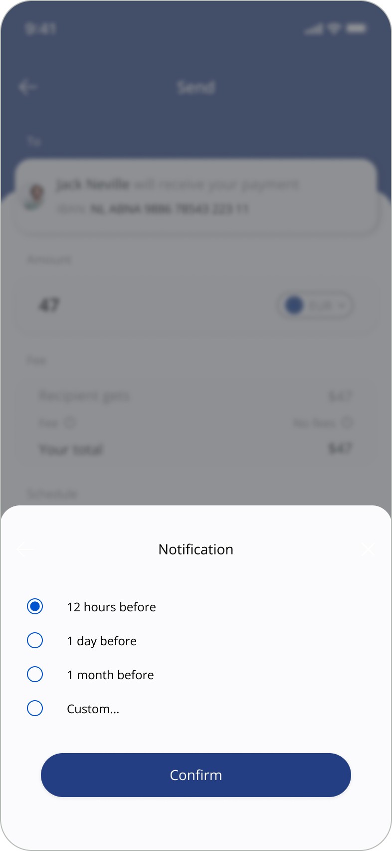
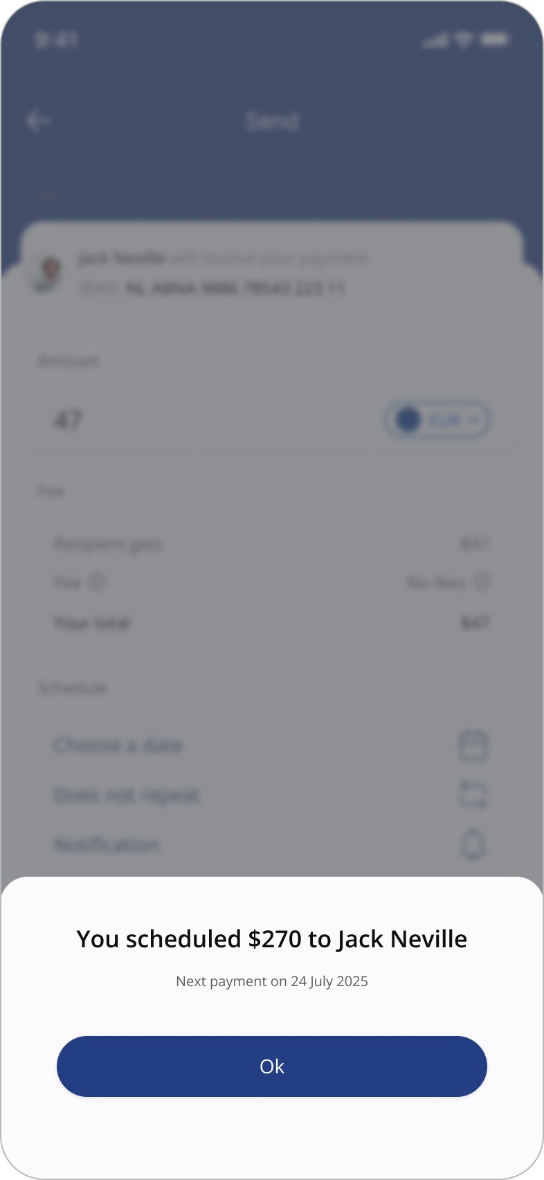
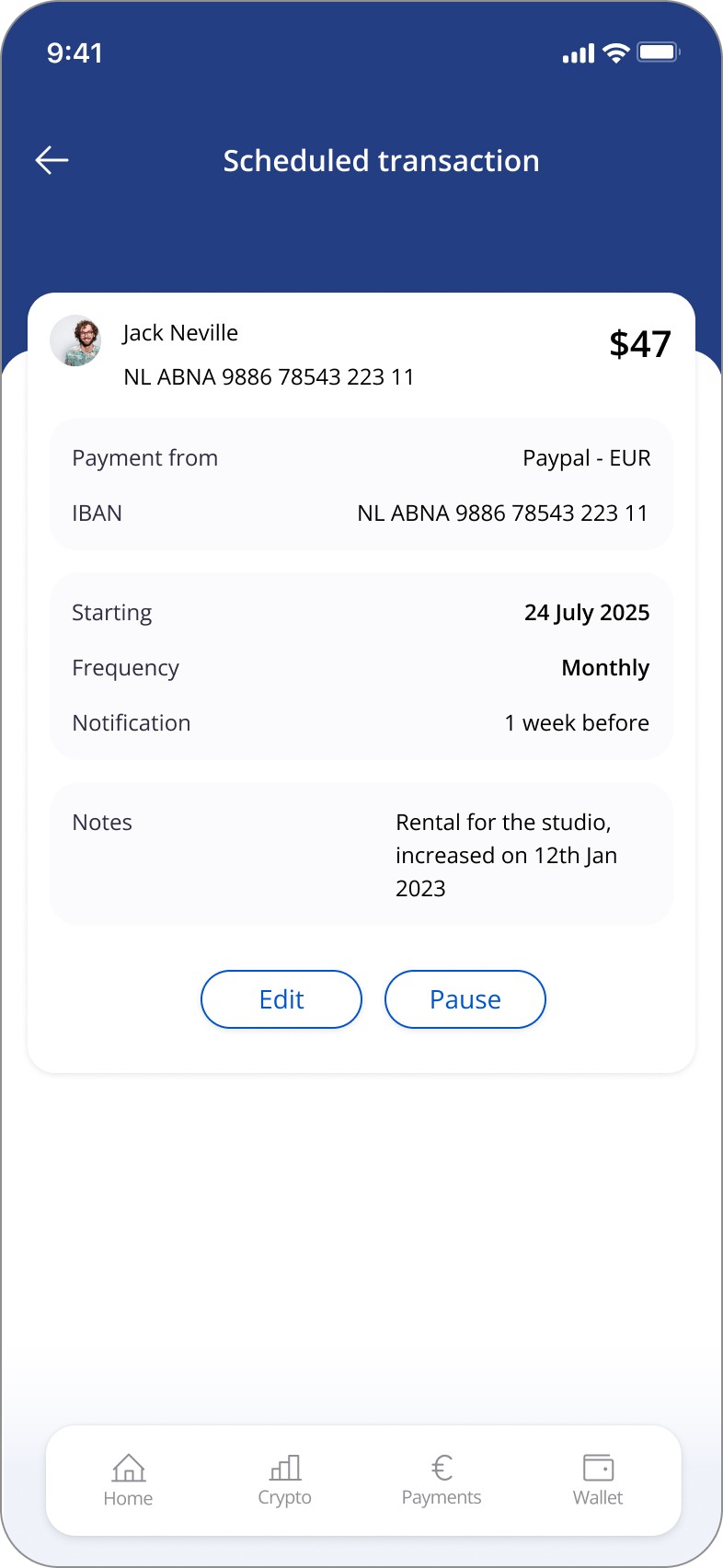
Introducing A "Schedule Payments" Feature
❝ I wish there was a feature that allowed me to set up recurring payments, like paying someone every 5th of the month.❞
❝ It would be great if there was an option to schedule payments.❞