Reducing time to treatment to save more lives in code red scenarios at trauma bay
OVERVIEW
We designed a remote patient-monitoring screen for the London Air Ambulance and Royal Mary Hospital trauma bay team.
OBJECTIVES
To minimize the time from arrival to treatment in emergency situations.
CONSTRAINTS
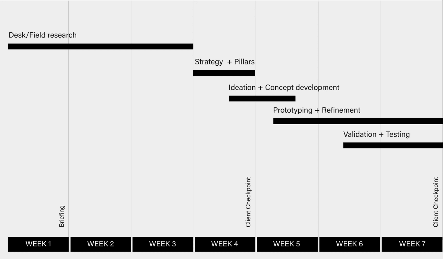
Our project, set within a strict four-month deadline for our master's program, demanded rapid progress. While the full implementation included a data input side, we preferred to focus on enhancing the user interface due to the time constraints and goals. This decision was strategic, aiming to prepare our design for future AI integration and ensure an on-time handover to the next team for further development. Additionally, designing for a new type of user presented a unique challenge that required special types of interaction and research.
Introduction
The London Air Ambulance (NHS) needed a tool to be able to facilitate communication between the helicopter paramedic team and the trauma bay team to save severely ill patients by monitoring them remotely en route to the hospital.
Paramedic-to-trauma bay communication as it stands now is mostly verbal, and there is no standardized or digitized way to stay in contact.
The London Air Ambulance (NHS) needed a tool to be able to facilitate communication between the helicopter paramedics team and the trauma bay team to save severely ill patients by monitoring them remotely en route to the hospital.

Problem
The first 60 minutes after a traumatic injury is the golden window that can determine a patient's life or death.
Modes, mediums, and styles of communication between the medical teams in emergency procedures were noted in a flow chart.


research Insights
Voice-powered surveys gave us insights into many problems faced by medical personnel in the trauma bay.
We received insights and ideas that later influenced our design, such as the “REBOA Blood Control Timer,” a device installed in patients to control severe blood loss.


FAILED CONCEPT
The Accordion Concept aimed to display historical and live trending patient data, but was too complex to be understood at a glance.
Medical personnel informed us that historical data is important to track the patient across time. However, the current live trending data is more important as it displays the patient’s actual state in the current time.
The Accordion Concept aimed to display both at the same time by zooming in towards the last 7-9 seconds documented. I named it “accordion concept” as it aimed to expand the perception of time, then shrink again.

After testing this concept in comparison with the other concepts, it did not prove to be successful as it was too unfamiliar and too complex to follow in an urgent use case scenario. It was not properly perceived.
Technicalities
Font size, colors, and text spacing have a significant effect on the rate of accuracy of a visual search and the reaction time during each search period.
When designing the information, on-glance legibility was an important thing to consider, as the surgeons, doctors, and nurses would use the screen as a fast means of retrieving information. Their attention is limited, so the cognitive load had to be minimal. High contrast was used to display quantitative physiology data such as HR and SpO₂ numbers.
The dark background is scientifically proven to have better results when paired with high-contrast colored numbers. Each physiology indicator was assigned a color based on conventions observed through patient monitoring systems. A proper font and size balance was also achieved by using a bold Helvetica weight commonly used with modern patient monitoring systems.
New CONCEPT
The Calendar Concept creates 2 time axis, one for paramedic-intervention events and another for physiology waveforms.
Pin Chun, my teammate, came up with the idea of separating patient interventions and physiologies, instead of having one time axis with everything noted down. In this way, we have a list of past interventions done, the current time marker, and the predicted future through the AI algorithm.

It proved to be the best decision when we tested it alongside the Accordion concept.
IDEATION AND WIREFRAMING
The Time Belt Method: A linear timeline with a past, present and future narrative where events and interventions are noted.
The “time-belt” idea was a concept we came up with during paper prototyping when we explored the idea of noting down events and interventions performed by the paramedics team. I iterated on the concept by exploring different placements of panels, interventions, and data visualizations. The idea was inspired by having a linear story start to finish


DATA VISUALIATION
We designed a panel with a live-stream visualization of patient data across a 5-second timescale and event-entry methods.
The patient’s ECG, oxygen saturation, and non-invasive blood pressure, are livestreamed through the ZOLL® X Series® monitor/defibrillator that is used by the HEMS team on-scene and en-route to the hospital. The monitor allows data entry in the form of interventions that update the screen’s intervention panel with respective timestamps.
With the assistance of the LAA dispatcher and senior hospital nurse, they can access the screen’s backend system to update manual data entries if needed, such as respiratory rate, C02 saturation, and the Glasgow coma scale. The visualization of the data graph was designed according to conventional patient monitoring systems
User perception
The role of human and clinical judgment in our AI feature was heavily criticized.
User testing revealed how our product was perceived positively by medical personnel. Most claimed to understand what it does, and what it aims to solve. However, the AI prediction concept was underdeveloped, as many did not understand the need for it, let alone how it worked.
User TESTS
We used the 3-30-300 method of showcasing our interface and asking the testers questions to confirm whether they can read the interface easily.
User testing revealed how our product was percieved positively by medical personnel. Most claimed to understand what it does, and what it aims to solve. However, the AI prediction concept was under-developed, as many did not understand the need for it, let alone how it worked.


DATA VISUALIZATION
Users found the visualization of clinical data and physiological monitors better in the calendar model.
They appreciated the clear representation of current information and the more spacious design that allowed for easier comprehension.
Color Coding and

TIMELINE AND INTERVENTIONS
Users valued the timeline that showcased the applied interventions and their successors, providing a quick overview of the effectiveness of procedures.
The accordion model was well-received, while the calendar model was considered simpler and faster.
The body map feature was not noticed or mentioned by users.

STRUCTURE AND READABILITY
Users found the structure easy to read and appreciated the application of SBAR and ABCDE strategies.
However, there was a suggestion to improve the ABCDE method by including temperature and making it more visually accessible, such as using a color-coded list.

ACCESSIBILITY
While colors were generally standardized, some users mentioned that they personally didn't rely on color differentiation and preferred black and white charts.
One user also mentioned being colorblind to red and green.
IMPACT
This initial prototype has since been funded and is in progress to be further designed, developed, and trialed across 4 major hospitals in London, and scheduled to be published by late 2026/early 2027